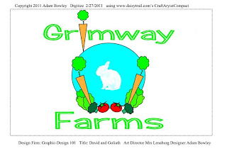
Designer: Adam Bowley
This would function at several 'scales' with only the veggies needing some enlargement if it was to be used on biz card sized items. The color/tonal contrast between the veggies and the circular sky-blue is fine here, but to show off the rabbit (he 'worked in' a stencil' included with CraftArtistCompact) we need to find a way to increase the difference (the contrast) between those two - perhaps by outlining the rabbit as well? Many other stencils come with the full program I'd bet.
[The 'Art Director' failed to notice both a major & a minor typo in this submission. Can you find them?]
[The 'Art Director' failed to notice both a major & a minor typo in this submission. Can you find them?]
Designer: Hannah Smith
Very cute. In some ways this is more of a 'promotional piece' such as a postcard or small flyer. Some re-working would need to be done if it was to be used at a smaller scale or the 'story' would be lost, but think how catchy this would be as a 15 or 30-second animated short!

Designer: Jamie Abraham
I like that the 'GF' becomes sort of a 'cattlebrand'.
My primary concern is whether or not folks who didn't know beforehand what company the logo was proclaiming might read 'Rimmway Arms' as often as not? Simple way to determine this is to vary the font-size and test it out with a few 'impartial' test-readers. Jamie went beyond my request that he set the design in a simple rectangle: by adding the carrot-filled photo behind the 'brand' he eliminated all doubt as to what kind of farming the company specializes in. Well done.

Designer: Sarah Treece
Cute design, but as I noted concerning a previous project, there is much too much going on for a traditional "logo". It could work really well as a billboard (but we need the company name even larger) or miniaturized by comparison - as a postcard. For a logo the designer could choose to simplify by choosing just the rabbit. NOTE: when constructing forms (specifically this rabbit) from multiple shapes, before you "group" them check their alignment front-to-back. You want to avoid unwanted overlaps such as the right leg is doing to the 'tummy' circle, above.

Designer: Melissa Brown
A straightforward design with bold colors and immediately 'readable' graphics. Only one possible shortcoming, depending on what purpose this design is to serve: if for "within the company" it's OK the full name is missing; if for "outside" as in letterhead stationary, advertising, etc. we must have the full name somewhere within the border of the design. Also, group your items and rotate 90 degrees so your teacher doesn't strain anything trying to contemplate your work! That said, well done.

Designer: Jamie Abraham
I like that the 'GF' becomes sort of a 'cattlebrand'.
My primary concern is whether or not folks who didn't know beforehand what company the logo was proclaiming might read 'Rimmway Arms' as often as not? Simple way to determine this is to vary the font-size and test it out with a few 'impartial' test-readers. Jamie went beyond my request that he set the design in a simple rectangle: by adding the carrot-filled photo behind the 'brand' he eliminated all doubt as to what kind of farming the company specializes in. Well done.

Designer: Sarah Treece
Cute design, but as I noted concerning a previous project, there is much too much going on for a traditional "logo". It could work really well as a billboard (but we need the company name even larger) or miniaturized by comparison - as a postcard. For a logo the designer could choose to simplify by choosing just the rabbit. NOTE: when constructing forms (specifically this rabbit) from multiple shapes, before you "group" them check their alignment front-to-back. You want to avoid unwanted overlaps such as the right leg is doing to the 'tummy' circle, above.

Designer: Melissa Brown
A straightforward design with bold colors and immediately 'readable' graphics. Only one possible shortcoming, depending on what purpose this design is to serve: if for "within the company" it's OK the full name is missing; if for "outside" as in letterhead stationary, advertising, etc. we must have the full name somewhere within the border of the design. Also, group your items and rotate 90 degrees so your teacher doesn't strain anything trying to contemplate your work! That said, well done.


No comments:
Post a Comment